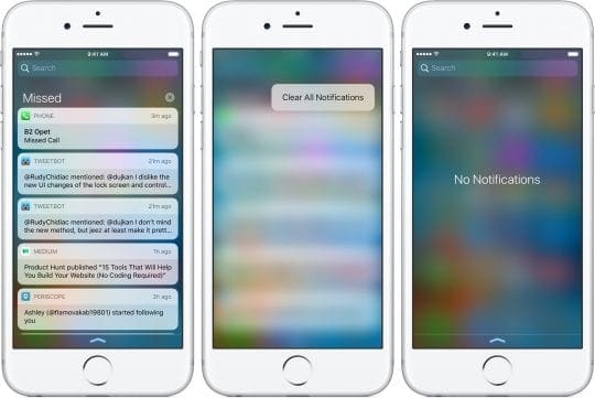
Notifications are one of, if not the most important feature on the iPhone. It’s a main portal for knowing when you need to do something. Imagine an iPhone without notifications. It would make it significantly less useful. Apple Watch, Apple’s most recent product, is essential built upon the idea of notifications. So how come Apple can’t figure it out?
Despite what seemed like a step in the right direction in iOS 10, Apple has taken a major step back with the new Notification Center in iOS 11. It now take significantly longer to look at notification than before. Today, we’re going to take a look at the history of notifications on iOS, and how Apple could improve.
Pre iOS 5

When iPhone originally launched, apps weren’t a part of the experience, so notifications didn’t seem like a priority. As time went along, and apps became prominent, notifications became important, and around iOS 4, things really started to become cumbersome.
That is because prior to iOS 5, all notifications would be alerts. These items would pop on your screen and interrupt everything you were doing until you picked an action. It was so bad, that poor notifications were the main driving force behind the adaption of Jailbreaking.
Apple realized it wasn’t working, and decided to get serious with iOS 5.
iOS 5
iOS 5 introduced three important changes to notifications that remain today.
The first was notification overlays. These no longer interrupted your workflow, and would appear before slowly disappearing.

The second was a lock screen notification area, allowing you to view and quickly enter alerts.

And the third was Notification Center, a central location for all notifications past and present.

These changes are still fundamental in the way iOS handles notifications today.
iOS 8

iOS 8 added one very important change to how notifications work on iOS: The ability to interact with them without leaving your app. Starting in iOS 8, when a notification arrived, you could slide down to reply straight from the bubble. A good start to making notifications better, but nothing happened beyond that.
iOS 10

iOS 10 built further upon the changes of iOS 5 and 8. First, they introduced an all new Notification Center. And second, all notification were now deeply interactive with 3D Touch. When you got a message, you didn’t just get a pulldown, you got the full message window. And, this worked for notifications beyond messaging. You could easily respond to things like calendar invites, and even apps like ESPN could show you a video in a notification.

Update: iOS 11 Beta 4
At the original time of writing, iOS 11 Notifications were abysmal. We’ll leave the original entry here for you to get an idea, but now things are much better.
For starters, notifications are once again a scrolling chronological list with no extra step required. The ability to swipe on them for actions has returned.
Additionally, the ability to click on notifications has returned with a new interface.
iOS 11

iOS 11 is a major step backwards. It is now significantly harder to interact with notifications. When you tap a notification on your lock screen, it doesn’t seem to take you to the app. It instead insists you either 3D Touch it or unlock your phone.
The biggest problem though is the new Notification Center. When you swipe down from the top of iOS, you are now greeted with something that looks identical to your lock screen. Then, to see past notifications, you have to swipe again, this time up. This seems like a useless and annoying change. My only theory is that iPhone 8’s speaker and cameras will result in the removal of the clock from the status bar, and this is there way of easily showing you the time.
This change is almost user-hostile and significantly hurts workflow
What could be better
First, Apple should revert to the old Notification Center. It was fine and certainly better than what we are about to have. But second, Apple could introduce deeper and more powerful notification tools, such as deeper selection of types of notifications from apps, more customizability of the alerts themselves, and maybe even the ability to change the haptic levels of each notification.
The progress in iOS 11 outside of notifications is good overall, and I’d be shocked if these changes make it to iOS 12, or even the official release in the fall.